
7 colors that match wood
Wood is one of the most versatile materials in interior design, but that doesn't mean any color works equally well alongside it. The tone, intensity and even undertone of the wood can completely change the perception of a room. Therefore, before choosing a painting, a sofa or textiles, it is advisable to observe what nuances the material that is already present has.
In reality, when we talk about colors that match wood, there is no single correct palette. Light wood allows you to play with more marked contrasts, while dark wood usually appreciates tones that provide light and lightness. Natural lighting and other materials in the room must also be taken into account.
These seven colors are a good starting point for creating balanced spaces, but the important thing is knowing how to use them.
1. Off-white: luminosity without creating a cold space
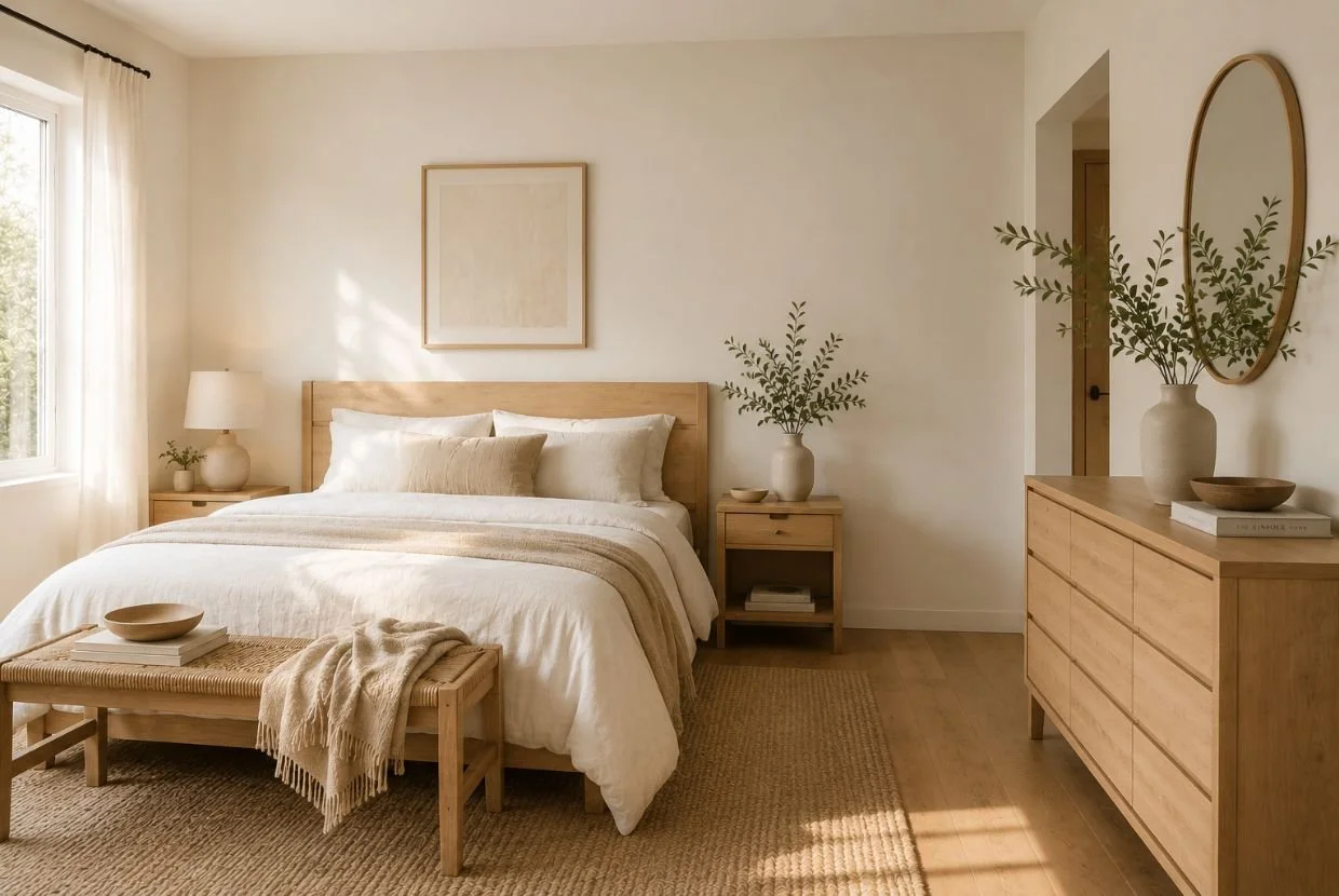
White is probably the first choice that comes to mind when thinking about colors that match wood, but it's important to distinguish between pure white and off-white. The second contains warm nuances that help enhance the cozy feel of wood without competing with it.
It is especially suitable for light oak, ash, pine or beech when you are looking for a bright and serene interior. It also works very well with dark woods, as it creates a contrast that allows the furniture to take center stage.
On walls, ceilings or large surfaces, a warm white can be a more sophisticated alternative to optical white. The result is clean, but retains the feeling of warmth that characterizes wood.
2. Beige and sand tones: a warm and timeless combination
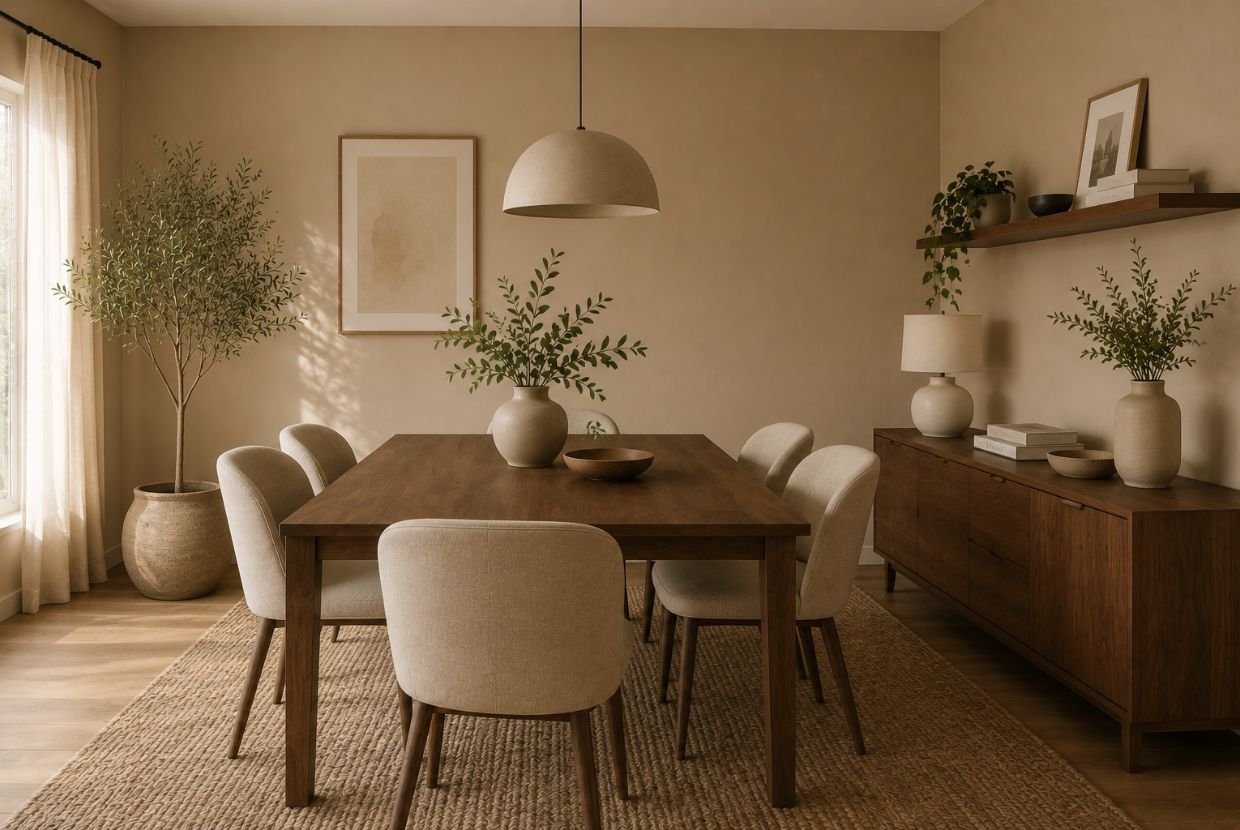
If you are looking for colors that combine with wood to achieve a cozy atmosphere, the beige It is one of the easiest to use. The sand, stone and cream tones allow you to build a continuous palette in which the wood integrates naturally.
This combination is especially interesting in living rooms and bedrooms, where a relaxed atmosphere is sought. Instead of using a single beige, different intensities can be introduced using textiles, walls, carpets, and upholstery.
With medium-tone or gold wood, soft earth colors reinforce its warmth. Instead, Along with walnut or dark woods, sand tones function as a counterpoint and they help to visually lighten the whole thing.
3. Sage green: nature and balance
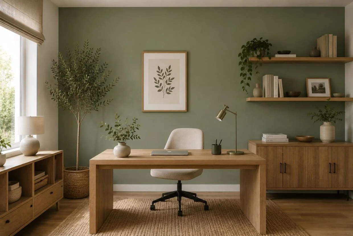
Among the colors that combine with wood, sage green stands out for its ability to add color without being excessive. It is a dull and slightly grayish tone that visually connects with the natural character of the wood.
Can be used on a complete wall, in furniture, in textiles or simply in small details. With light woods it creates fresh and bright environments, while together with medium-toned woods it can provide depth.
Green also allows you to create interiors with a more organic aesthetic, especially when combined with natural fibers, stone, handcrafted ceramics or linen.
If you don't want the space to have an excessively rustic appearance, the key is to balance it with simple lines and contemporary materials.
4. Petroleum blue: contrast with personality
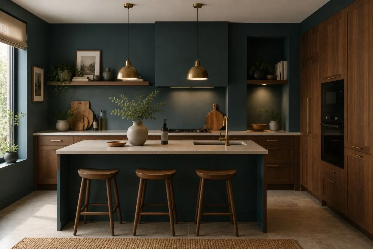
For those looking for colors that match wood and want to move away from neutral palettes, petroleum blue is a very interesting option. Its intensity allows for contrast, but its greenish nuances make it engage particularly well with natural materials.
It works very well with oak, walnut and other mid-toned woods. On a wall it can become the perfect background for a main piece of wood, while in small doses it is useful for introducing color through seats, curtains, cushions or decorative elements.
It's also a good alternative for achieving a more sophisticated interior. Compared to a blue that is too bright, oil provides depth and is easier to integrate into an adult and balanced palette.
It should be used to some extent with dark wood. If both elements are very intense, it may be necessary to introduce clear surfaces to prevent the room from losing luminosity.
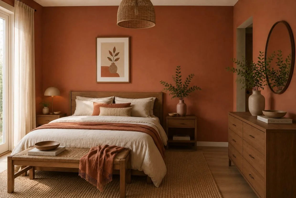
5. Terracotta: warmth with a Mediterranean touch
Terracotta shares a warm base with wood, so both materials can create a particularly cozy combination. However, using it well requires controlling the intensity.
Clay, tile, and soft terracotta tones work especially well with light and medium woods. They can appear on a wall, a rug, an armchair, or ceramic pieces without needing to become the dominant color.
In addition, it is an interesting alternative for Mediterranean-inspired interiors, where it can be combined with natural wood, stone, plant fibers and handcrafted-looking textiles.
The key is to prevent all elements from being warm and orange. Introducing off-white, beige, warm gray, or some greenish hue helps create contrast and prevents the whole from becoming too monochromatic.
6. Warm gray: balance between wood and architecture
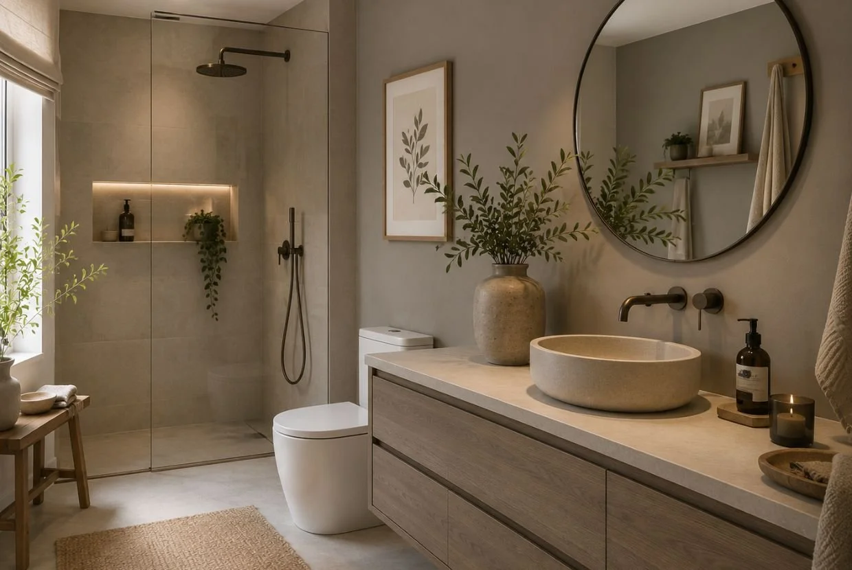
Gray may seem like a cold choice to accompany a material as warm as wood, but it all depends on the hue. Warm grays, greige, and stone tones work very differently than bluish grays.
They are a good option when we want wood to stand out without necessarily resorting to white. They also help connect wooden furniture with other contemporary elements such as metal, glass, stone or microcement.
In the case of walnut, gray tones can generate elegant contrast because they balance its warm nuances. Kenay points out grays and blues as interesting options for woods with yellowish and warm tones.
In small spaces, however, it is advisable to choose light grays and pay attention to the amount of natural light available.
7. Black and anthracite: contrast to highlight the wood
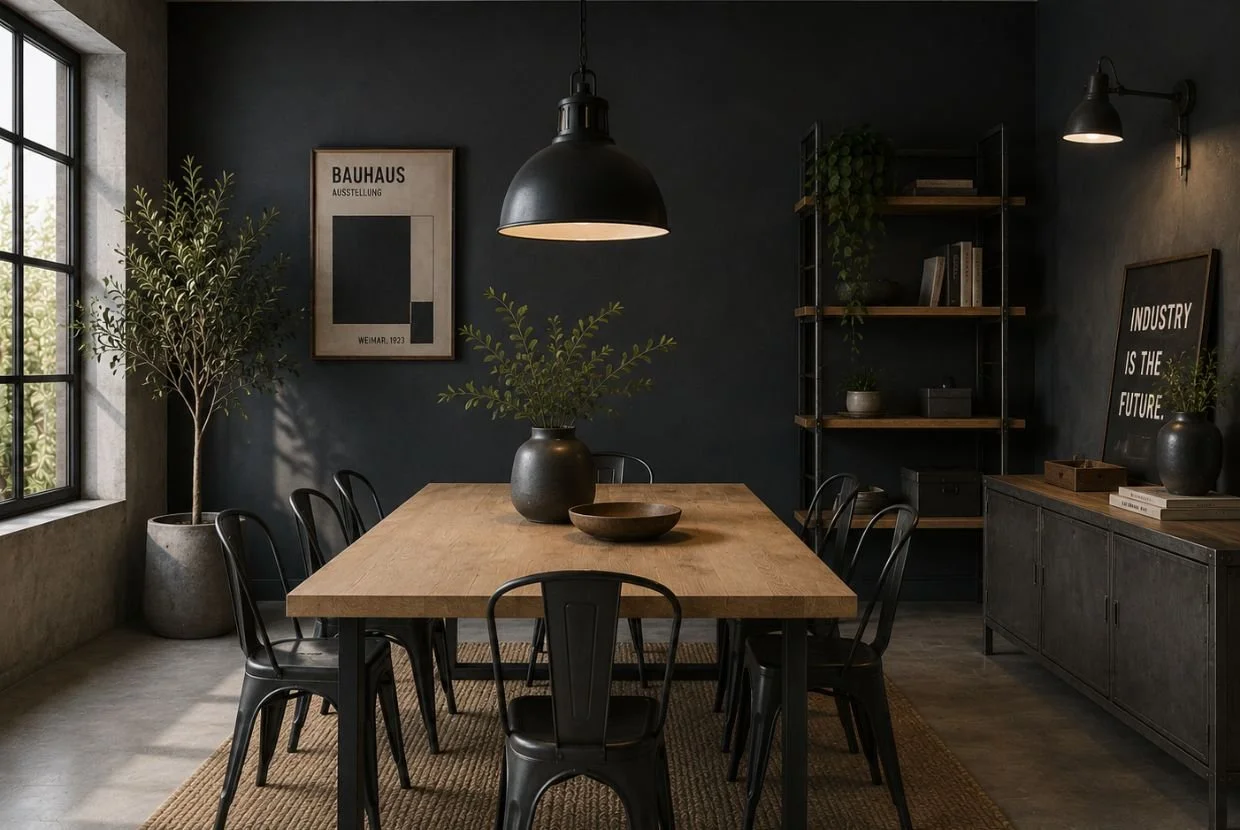
Black shows that colors that match wood do not necessarily have to be light. With light wood, the contrast between the two can be very elegant and contemporary.
An oak table with a black frame, dark woodwork, or a large lamp can provide definition to a predominantly neutral space. It is also a common combination in interiors with industrial or contemporary aesthetics.
Caution appears when the wood is already dark. Walnut, wenge or ebony together with large black surfaces can create an environment that is too heavy. In those cases, it is preferable to reserve black for details and balance it with light walls, stone, natural fabrics or reflective surfaces.
How to choose between these colors depending on the type of wood?
The choice should not be made solely thinking about the color we like the most. One of the most common mistakes is considering that all wood has the same visual behavior.
The light woods, like him natural oak, ash or birchThey have a greater ease in coexisting with intense tones. A green, blue, or even anthracite wall can create interesting contrast without making the space appear heavy.
In the medium woods, as determined oaks, beech trees or cherry treesThere is greater freedom. Earth tones keep the feeling warm, while deeper greens and blues allow for the introduction of sophistication and contrast.
The dark woods They need a different consideration. Its visual weight makes light tones such as ivory, off-white, cream or sand especially useful to compensate for them. This does not mean that you have to give up color: an olive green or a soft terracotta can work perfectly as accents.
It is also important observe the undertone. A wood that pulls towards yellow will not behave the same as another with reddish or grayish hues. Before choosing a painting, it is advisable to compare a sample of the color directly next to the wood and observe it at different times of the day.
Do all wooden furniture have to be combined?
Not necessarily. Mixing different shades of wood can add depth and prevent an interior from appearing too uniform. In fact, combining light wood with darker wood is a strategy used to create visual contrast.
The important thing is that the mixture seems intentional. A simple way to achieve this is to keep one wood as dominant and use the others in secondary pieces. It also helps to repeat some tone in different elements to create visual connections.
In short, the colors that combine with wood depend on both the material and the environment you want to achieve. Light wood can allow for strong contrasts; dark wood usually benefits from a luminous base; and mid-tones allow you to play with a very wide range. Rather than following a closed rule, it is about observing the whole and seeking balance between color, light, texture and proportion.
Cristina Garau Interior Design: space design designed for each project
In Cristina Garau Interior Design We work on each space from a global perspective, taking into account the existing materials, lighting, layout and personality of those who inhabit or use it. If you are planning a home, a premises or a office renovation in Palma de MallorcaWe can help you define a coherent interior design proposal that is carefully considered down to the last detail. Discover our work and contact Cristina Garau Interiorismo to talk about your project.